Analytics overview
Overview is a section of the Adapty dashboard that provides analytical information through various chart views. This section includes the following parts:
- Control panel of the Overview section.
- Money analytics section.
- Subscribers analytics section.
- Conversion analytics section.
- Issues analytics section.
The Overview section provides a high-level analytics view. For detailed information, refer to the Analytics section.
Control panel of the Overview section
All customization options are global for the Overview section and apply to all charts.
The Control panel provides a set of tools to customize the view of the Overview section according to your preferences.
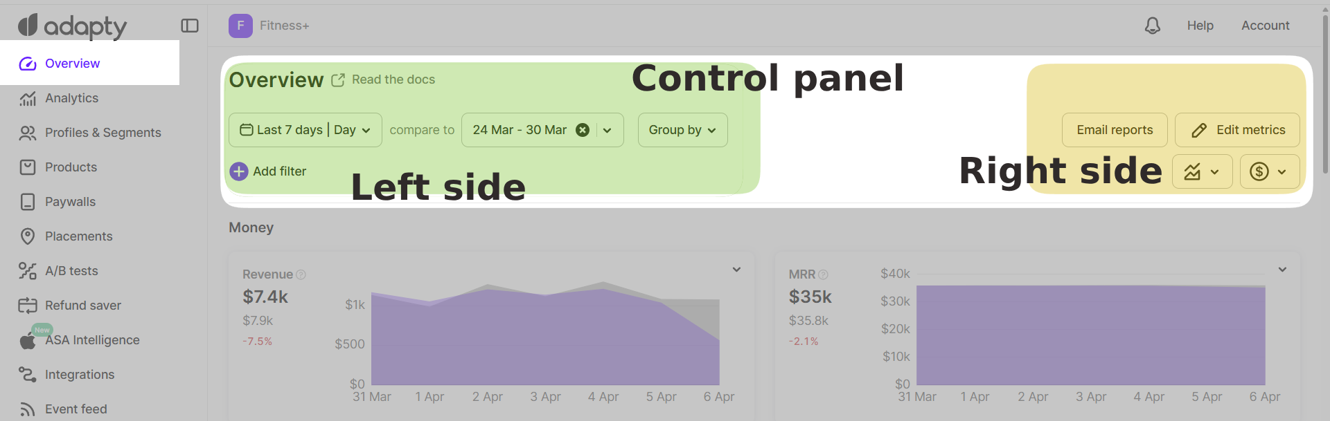
On the left side of the panel, you’ll find the date and grouping tools:
- Dropdown calendar — allows you to select a date range for the analytics displayed in the charts. You can choose from predefined ranges (e.g., last 3 days, last month, last 28 days, last 3 months) or set a custom range. Additionally, you can select the time unit for the charts: day, week, month, quarter, or year.
- Compare to dropdown calendar — enables you to select a previous period for comparison with the current data range. Available presets include: previous period, previous month, previous quarter, previous year, or a custom period. On the chart, the compared data will appear as a differently colored line.
- The final tool in the data tools set is the Group by dropdown list, which allows grouping by: country, store, or app. The charts will display the grouped information accordingly.
On the right side of the panel, you’ll find notification, metric editing, chart display, and data visualization tools:
- Email reports button — redirects to account settings, where you can select the frequency of email reports: daily, weekly, or monthly.
- Edit metrics button — opens additional control tools:
- + Add button — provides a list of Overview metrics that you can choose to display in the section. As an additional feature, you can rearrange the order of charts using drag-and-drop.
- Count installs — clicking the dropdown list allows you to select the counting method: counting installs as new device_ids, customer_user_ids, or profiles in Adapty.
- Time zone — select your time zone to ensure accurate data.
Once the setup is complete, click the Done button to save the new preset.
- Chart type switcher — allows you to change the type of charts. The following chart types are available: stacked column, stacked area, line, 100% stacked column, 100% stacked area, and pie chart.
- Revenue data display switcher — offers three options for displaying revenue data on charts:
- Gross revenue — displays the total revenue, including taxes and commission fees from both the App Store and Play Store.
- Proceeds after store commission — displays the revenue amount after deducting the store commission fee.
- Proceeds after store commission and taxes — displays the revenue amount after deducting both the store commission fee and taxes.
See Store commission and taxes for more information.
Money analytics section
This section contains charts reflecting financial metrics, such as:
- Revenue chart — displays the total revenue earned from both subscriptions and one-time purchases, minus any revenue refunded later.
- MRR (Monthly Recurring Revenue) chart — displays the normalized revenue generated by your active paid subscriptions on a monthly basis.
- ARR (Annual Recurring Revenue) chart — shows revenue from all active auto-renewable subscriptions, normalized to one year.
- ARPU (Average Revenue Per User) chart — displays the average revenue generated per user for a given period.
- ARPPU (Average Revenue Per Paying User) chart — displays the average revenue per paying user.
- ARPAS (Average Revenue Per Active Subscriber) chart — displays the total revenue divided by the number of active subscribers.
Subscribers analytics section
This section contains charts reflecting subscriber-related metrics, such as:
- Installs chart — shows the total number of users who have installed the app for the first time, as well as reinstalls by existing users.
- Active trials chart — displays the number of unexpired free trials that are active at the end of a given period.
- New trials chart — displays the number of trials activated during the selected time period.
- New subscriptions chart — displays the number of new (first-time activated) subscriptions in your app.
- Active subscriptions chart — displays the number of unique paid subscriptions that remain active at the end of each selected period.
- Non-subscriptions chart — displays the number of in-app purchases, such as consumables, non-consumables, and non-renewing subscriptions.
Conversion analytics section
This section contains charts reflecting conversion metrics, such as:
- Install → Paid chart — displays the percentage of users who installed the app on the selected date and later paid for their first subscription (directly, without a trial). If X is the number of installs (consistent across all products since no product is chosen at the installation stage), and Y is the number of those from X who paid, then Conversion = (Y / X) × 100%.
- Install → Trial chart — displays the percentage of users who installed the app on the selected date and later activated a trial. If X is the number of installs (consistent across all products since no product is chosen at the installation stage), and Y is the number of those from X who activated a trial, then Conversion = (Y / X) × 100%.
- Trial → Paid chart — displays the percentage of trials started during the selected period that later converted to paid subscriptions. If X is the number of trials started, and Y is the number of subscriptions activated after those trials, then Conversion = (Y / X) × 100%.
See the Analytics Conversion article for detailed information.
Issues analytics section
This section contains charts reflecting issues-related metrics, such as:
- Refund events chart — displays the number of refunded purchases and subscriptions.
- Refund money chart — displays the amount of money refunded during the selected period.